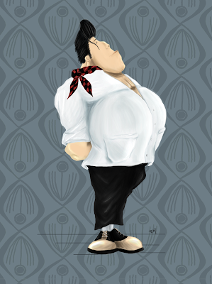
So for this Beautician Character, which I had my design already, I started to add some colour, being him a proud of himself for becoming what he is in his profession, I decided to give him, I would say a ' Clean' look, and sophisticated, as we ll know, most of the male beauticians have this delicate way of fashion. So keeping the 'Quiff', I decided to shine it up a bit, looking like hehas huge amounts of gel on (Brylcreem :P), For the skin tones, I decided to give him this clean look but at the same time oiled, so looks he just had put any cream on his face. For the clothing, I based my painting on a previous post where I researched the 50's hairdressers uniforms. A clean shirt, with black trousers and some 2-tone shows. Also I had this scarf featuring the same colours of a "logger" shirt, but instead of the normal fabric, I depicted as if it was satin to add a more delicate look.
I did want to go hyper-realistic with my colour palette, So I just used around 3 tones for every colour.

6 comments:
Hey dude, this looks proper excellent character. Your colouring is great as well. ^_^
Looks great Ruben, a very distinguished character with a lumberjack build. I usually create progressive saves as well for further backup, as well as being as to show/return to earlier progress if need be.
For feedback, I think it just needs some more contrast in darker areas for some more form, as its looking a little flat in places. Its nothing major but it should work wonders as a straightforward fix.
Looking forward to seeing your character in action! :)
I dunno why, when I am looking at it on my mac is looking ok but when I go into my pc looks really bright and flat :S, just have to up the contrast more.
Hey ruben, looks much better with the improved contrast :)
Yeah be wary that monitors can yield different results if not set properly. I think theres some software to help correct this, but you should be able to tweak pretty well manually.
I really had to tweak in the pc, on my mac looks a bit darker now lol :P
Thanks for the feedback , Leo!
Post a Comment