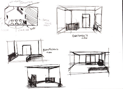
I started by quickly draw the overview of the shop to help place the objects in it. Also i applied different views for example, the beautician's and the customer's.
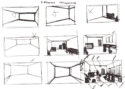
 After, to help me with depicting the site, I tried different perspectives, as I didnt want just some plain drawing and flat.
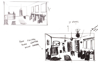
 As I liked the last perspective, I decided to complete it by placing some the objects in the set.
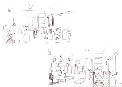
 Finally, I decided to 2 to bigger sketches already with the objects, ready to send it to photoshop. Personally, I prefer the right sketch as I really like that perspective that I tweaked as I liked.
So I have my guide to get into Photoshop and create my concept design. Although its perspective may not be perfect, when I get into photoshop, I will tweak it and scale objects as I move along.

No comments:
Post a Comment