So this and the following post will explain what style I want to achieve and what direction I want to go with the character design.
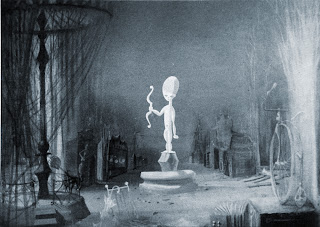
My research began with looking at 1982's short animation Vincent, by director Tim Burton, where he uses a really strong style influenced by the early German Expressionists, shots with high contrast lighting and vast shadows merging the objects in the room with them, also the minimalist sets with silhouetted objects, intensify the eeriness of the environments. A style that defines Tim Burton and his world.
Vincent, 1982, Tim Burton
After watching Burton's Short Animation, I took Phil's advice and watched the short animation The Tell-Tale Heart, 1953, directed by Ted Parmelee. This animation is a transcription from a short story of one of the most influential horror and suspense writers of all time, Edgar Allan Poe. The part of the credit of the animation has to be given to Paul Julian, who was responsible for the Art Department. As this animation uses one of the most graphical styles I have seen applied to an animation. Although a style of simple nature and aided by animation techniques such as morphing, help to drive the narrative. Minimalism is the keyof the animation, which makes our heart jump in certain situations, truly carrying the suspense of the short-story to the screen. Editing also plays an important role in it, with rapid transitions, keeping the audience drawn to the animation, with their heart almost coming out.
A simple, effective, dark, minimalist approach to the original body of work.
The Tell-Tale Heart, 1953, Ted Parmelee
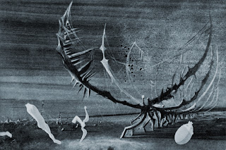
After watching the previous animation, I did some more research and luckily found 2 Croatian short animations, which seemed to bear the same style, a dark, minimalist, and expressionist. Although lucky to find some stills of the animation, I could not find the actual animation. But by the looks of the stills it looked really promising.
Tifusari, 1963, by Zagreb Films
Director & Scriptwriter- Vatroslav Mimica
Design and Backgrounds- Aleksandar Marks
Animation- Vladimir Jutrisa
I found this animations stills great because they clearly showed a strong dark style reminiscent from the German expressionists prints, such as of Max Pechstein. hopefully, I will be able to find this animation somehow, as I feel important to aid my art direction.
The second animation I found by the same studio is called Happy End, 1959, and once again unfortunately i wasn't ale to find of it. Although, the stills of this animation look less dark, the still bear the minimalism approach of the first, where the set is nothing more than it is really needed. however, i found this animation belonging less to the German expressionism style, but more connected to a dark symbolism or even surrealism.
Happy End, 1959, by Zagreb Films
Director & Scriptwriter- Vatroslav Mimica
Design- Aleksandar Marks
Backgrounds- Zlatko Bourek
Animation- Vladimir Jutrisa
After looking at this 2 unfamiliar animations, I once again took Phil's advice and checked the trailer for Peur[s] Du Noir, or in English Fear[s] of the Dark. For what I found, it is a film consisting in 5 short animations by 5 of the most influential contemporary graphic artists. Although i wasn't able to get a full watching on the animation that Phil have mentioned me (the 5th one), I did find a short clip of it, and by only watching that small clip I have exactly understood why Phil, wanted me to watch it, the almost non existence set which blends with the character and vice-versa, is just brilliant and by no means affects the storytelling, on contrary it actually helps for a really easy reading of it.
The small clip showed me only what I needed for me to crave to watch it, suspense felt just by watching was great, though short as the clip finished.
Peurs Du Noir, 2007, Richard McGuire
Lotte Reiniger in her animations told most of the famous tales known nowadays in a rather peculiar way, by using a cut-outs of the characters and a 2D detailed background, she mixed them to in order to tell the story.
Cinderella, 1954, Lotte Reiniger
Being my animation concentrated on the characters and less on the environments, i thought it could be a good technique to invert what Lotte Reiniger did, so in my case I would have 3D characters and silhouetted or dark looking props, both of them sharing the same Art direction.
in order to achieve something similar, I found a music video called The Pied Piper by Yoriyos, in this music video it is shown how CG can also have a 2D quality, and if built in layers can pretty much mimic a really good environment, I do think it could be quite effective to create my world revolving this idea, as it easily fits the style I want to go for.
And my research continues... :)
Links:
Tim Burton- Vincent
Ted Parmelee- The Tell-Tale Heart
Zagreb Films- Tifusari & Happy End Stills
Richard Mcguire- Peur[s] Du Noir
Lotte Reiniger- Cinderella


No comments:
Post a Comment