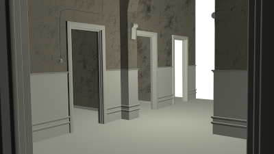
but before I would like to update with the textures of the Hospital Walls, I have created them from scratch and I didnt use a tile, I painted them on the top of the map.

I still Have a bit of work to do with these textures, maybe tweak a little more the Bump Map and and see if something is wrong, but the first impression of the place will be like this.
P.S.: Also I added just an ambient light to I actually can see the texture properly. it wont be the final light.

5 comments:
Hey again Ruben, are we going to see some variation with the wall textures in the rooms (peeling wallpaper etc). try and think of ths walls story (I know it sounds very drama school), but think where people would have rested there hands over the years maybe by a door as they peer in, where they would have brushed a corner as they passed someone else, all these incidents leave marks that over time build up to create a layer of interesting marks and indentations. Also dust and grime build up over dado rails, sconces and door frames. Dont forget to soften the edges on your wall sconces, I'm sure you'll see where.
Simon, how can I do some dust on the objects??
Hey Ruben, Check out one of my recent posts...
I was flicking through the Digital Art Master Vol.3 book and saw this image, it reminded me of your texturing and walls, I think the second example is close to what i reckon your walls should look like. If you dont mind me saying so.
thank you richard..
that texture is amazing, I hope I can mke it look like that.
Thats a great example of a distressed wall Richard, a great way of applying grime and dust is to use the layers modes in combination with grunge brushes. As an example to break up a large section of wall I may well drop a hi- res moss or lichen type image over the wall surface, set the mode to overlay or multiply then drop the opacity way down to 20% or whatever looks rightmaybe add a bit of gaussian or motion blur. This should provide a subtle shift across the surface from which you can start building. You can duplicate this layer then start erasing areas with your grunge brushes to "clean" areas which would typically stay cleaner.
In richards example they have used brushes to break up the hard red edge. As well as painting dust in your colour map you can add to the effect on your spec map by making the areas that are dusty more matte than maybe the gloss finish on a dado rail.
just remember to work in layers, as this will make it easier to manipulate and set up your bump and spec maps.
Post a Comment