Monday, 29 November 2010

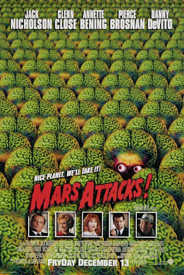
Film: Mars Attacks!, 1996, Tim Burton


Last week, and part of week 10 of our narrative project, we watched quite different film, despite belonging to the same Sci-fi genre, it did not belong to the B-movies Golden Era, the 50's. the film of choice was Mars Attacks! a 1996 Sci-fi/ Action/ Comedy directed by Tim Burton and based on a 1950's trading card game.Although not being a b-movie, it is considered a pastiche to them, because not only is based on a 50's Trading Card Game, but also because it refers many times to them.


Mars Attacks!'s main story ( it consists in many small plots with a lot of characters) revolves around a martian invasion set to the planet earth. When these aliens firstly surround the planet with their millions of spaceships, the man in the power, the president of the United States of A, played by Jack Nicholson, is asked to make decision whether to attack the aliens or welcome them to our planet.
Convinced by the Scientist (Pierce Brosnam) that the martian come in peace, the president opts welcome these species, So the American forces set up a welcoming party to greet the martians. having a translator  they try to communicate to each other, and when seemed to go in the good way, something unexpected happens.
As one dove flies pass the Aliens, they kill it and just after they start to attack the humans just like an invasion. Being pressed by the military forces they fly away.
The president horrid with what happen, asks his scientist what happened, who replies that it may have been a misunderstanding, and insists to connect with the  martians again.
When invited to come down again the martians apply once again a little more of their cruel humour, by pretending that they come in peace and then destroy any possible living soul at the site.
In the second attack the scientist is kidnapped and and held as a experiment in a grotesque yet funny way.
The president not knowing what to do, search for a different solution, tired of being tricked he asks for the army's nuclear services help.  However, such a powerful missile does not have any effect on the martians, as they funnily, absorb it with a machine and give to their leader to smoke it.
Proven incapable to defend against the alien invasion the President of USA, finally quits and in a final face-off with the enemy confronts it and gives a touching speech. In which the alien responds with a tear. However this tear is nothing more than another dark humor joke, as the alien is about to seal the deal with the president, he uses one well-known joke of the fake hand, where the device with live of its own attacks the president and pierces him right in the stomach.
Due to what happened, earth is in the edge of being dominated by Martians,  though funnily enough at the last minute it is saved in a rather unusual way. When a young man tries to rescue his grandmother from home which has been invaded also by the aliens. She distracted by our music, hears the grandson, turns and the headphones, come out of the stereo. Giving the Aliens the chance also to listen maybe one of the most horrid songs of the 1950's. Not used to such exquisite sound aliens die with their brains bursted.
And to save the world the young man and his grandmother travel to the closest radio station and put the tune playing. And there it is the world is saved, not from the tune, but from the aliens.


Mars Attacks! is often bluntly criticized as not a really good film, for instance, Peter Stack from San Francisco Chronicle,  states that [In MarsAttacks] ' Hilarity never seemed so tedious', however Jeffrey Westhoff from Northwest Herald, disagrees by saying  that ' When the film's energy kicks in, though so does Burton's flair for black comedy', indeed, this film creates a pastiche of not only the 1950's Trading Card Games, but also of all the other Sci-fi Invasions genres that appeared before, by slightly twist it into a dark  comedy/ action film, full of gags.
In terms of set design, the highly budgeted sets with last of the technologies and the use of CG at its first steps into the world, really adds a lot to the film, cutting the costs of the overall production.
The array of stars starring in this film is immense, from Jack Nicholson, Glenn Close, Danny De Vito, and many others,  truly emphasizes the idea of high budgeted film with good acting, everything the 1950's b-movies and Sci-fi Films were not known for.
In terms of narrative, and according to Margaret A. McGurk from the Cincinnati Enquirer, '[Mars Attacks!] got attitude, goodness knows; it has stars by the fistful; and it certainly was made with technical skill. What it doesn't have is enough story to fill an hour and 46 minutes.' As McGurk explains this film as a lot of good technical achievements, however it does lack in consistent story-line, leaving the film with a good structure but a weak foundation. Where Burton, used several mini-plots in order to add more interest to the main plot, however he doesn't not succeed.


Truly, an enjoyable film, to understand the meanings of pastiche in cinema specially in the Sci-Fi Genre , and also to learn that a good film is mainly based on a good story-line, therefore a good script.

Saturday, 27 November 2010

Unit 2.02- Character Design: The Making of Robot Pirates

As a final post for the character project, here is the presentation I did to introduce my characters. Based on the pirate theme, this presentation holds all the important concepts that can accompany a character in a Design Bible, such as the profile sheets, turnarounds, expression sheets, props sheets and colour palette sheets for each individual character, but also the some poses and character action pages.

So here it is kids!! the 1980's cartoon that you were all waiting for!!!


Thursday, 25 November 2010

Unit 2.02- Character Design: Cover Page Layout and Final Design Bible Front Cover

When getting most of the things done, and ready to put in the design bible, I decided to create the front cover of the Design Bible. Firstly, I had to pose the characters together to and try to merge them in to something interesting. So I placed in this way:


I chose this pose because clearly you can see a clash between characters, and it being decimated by the Giant robot in the middle. In a manner of arrogance and despair Captain Hidalgo "Bolt" looks away, while "Metal Jaw" Gertie is there to defend him. on the opposite side is John "Rusty", in a pose as it is venturing and challenging the Captain. 


With this little story told, I decided to professionally present my work by creating a layout for my design bible, using the pirate's theme as main influence.


Later today, I will posting a page-by-page of the design bible, firstly let's present it.

Unit 2.02- Character Design Colour Palette Sheet

After coming up with the definite poses, I started to pain the characters, to add some more interest in them. So mainly my colour palette was based on the actual pirate colours, and engines of the 1900s, mainly steam-punk colours. Having in the beginning decided to use traditional media to paint the characters, as they give really good mark making drawings, I started to paint my sketches, but also my hands and my living room table, the good side is that it didnt reach the walls.
For someone curious I painted with Pastels, Sanguine Pencils and normal colouring pencils, as they gave me the chance to easily and traditionally create a rust effects and silky fabrics.
And it turned out to be a really good experience and definitely something to use in the following projects when creating textures.


P.S: note that some of the colours were tweaked in photoshop but nothing major painted.

Unit 2.02- Character Design: Poses and Silhouettes

After coming up with all the construction of my character, and after creating some rough poses, i felt I was ready to create the final poses, the ones that will be featured in the character design bible front page.
So I explore some poses that could portray the character's personality.


John "Rusty" Final Pose


Captain Hidalgo "Bolt" Final Pose


 "Metal Jaw" Gertie Final Pose


In order to test this poses I created some silhouettes to see if they were working. and I was quite pleased with the outcome, as some of this poses can be concrete in depicting the character's personality.


Finally I was also happy with the pirate feel they also have, so do the speak we have in left to right order, the arrogant Pirate Captain , the bulky yet silly bodyguard and the adventurous and rebellious Hero.

Unit 2.02- Character Design Workshop Week 9

Here is the final week workshop for our character design project, in this workshop we were taught that the environment has a important role, when creating our characters. Although not being part of the brief, it is always good to explore, some environments.

I was given abandoned Arena, and started by sketching some quick thumbnails for it.


Although they are not many, as I was with my head somewhere else, more project related, I felt that some of this quick thumbnails that take no longer than 30 secs to a min to do, have some potential. 
Also Justin Wyatt, mentioned that to add more a feel of abandoned maybe I should had some wildlife inside, trees, etc. 

Overall a really good workshop, and I would like to thank Justin Wyatt to take the time to teach us some character design, and gives us some tips really useful that I will take aboard to be used also on the next characters.

Sunday, 21 November 2010

Unit 2.02- Character Design Character Action Sheets

Last workshop, Justin Mentioned to better complete your Design Bible, and to better understand the action of you characters we should draw some of these actions.

So without losing anymore time, I did a couple of them for each of the characters as well as some where 2 characters interact. I have to say it was really fun to do this, to get even closer to the character and think as they would in certain circumstances.


These pages along with the posted before are not in the definite layout of the design bible, these are only for blog purposes. Clear and effective !

Unit 2.02- Character Design Turnarounds

Here is the turnarounds for my 3 characters, I have carefully tried to match the all 3 views, this sheets are important not only to see the character in 3 dimensions, but also crucial for modeling purposes.


 Overall, I quite difficult job to do, but a proof that you know your characters inside out.

Unit 2.02- Character Design Prop Sheets

As promised yesterday and a little delayed, here is the deconstruction of all the props in my characters. Being a technical guy, I decided to singularly draw each of the props, to better understand my characters.


To note that this is the definite prop list/ sheet that will be featured in the design bible, which is no more that a clearer and more detailed version of the previous Props Displacement Sheet.

Saturday, 20 November 2010

Unit 2.02- Character Design Size Comparison Chart

Here is the Size Comparison Chart of my 3 Characters, just for a spoilers at this time they are using already the final prop designs, the sheet that will be posted later on the blog will clearly show what they are wearing and, what choices I have made.

So far I like the comparison between the characters:


Hopefully, It is visible which character is which in the context of my cartoon, but if it is any confusion let me know.

Unit 2.02- Character Design- Expression Sheets

Firstly, I I want you to update on one of the face designs, the hero face design was looking slightly scary and not a friendly, so after speaking with Justin, he helped me to come up with a face which is friendlier and proper for a hero.


I do think Its is a big improvement, and definitely funnier to come up with expressions for it. So without anymore talking, I will present you the Expression Sheets for all the characters. I have done only the emotions that the character will possibly have. 


I have to say It was really fun to do, I know I understand what Justin said in 1 of his Workshops, that you really have to love the characters you are doing, because they clearly come out of your imagination and head much better.


Unit 2.02- Character Design- Prop Displacement Sheets

Firstly, I would like to say that i have not been posting much lately, as I'm quite busy trying to finish the Character Design Project. however< a few post will come in chunks... so keep tuned. 

Enough excuses and let's get down to the point, I have been working on my character design project, and decided to dress my previous characters.  


So before I get focused on detailing all the props I did, what I like to call a "Prop Displacement Sheet", where through A lot of brainstorming I decided which gadgets each of the characters will have, as well as weapons or other accessories.

It is important to note that this is not the definite Sheet, and many thing will change along the way. 

John"Rusty" ( Hero)- Prop Displacement Sheet


For the hero I decided to add the things mentioned on the. Also I tried to design weapons for him, however being the good guy and the hero for all the kids and to not promote violence, my design for the weapons change slightly, so I added some more rounded shapes, a smaller scale, to blend with the hero shape and not stand out the most.

Captain Hidalgo "Bolt" (Villain)- Prop Displacement Sheet

For the villain I also followed my previous descriptions of him on the  Character Profile Sheets, and the clothing, accessories and weapons influence maps. So Captain Hidalgo "Bolt" will have some of the props seen in real pirate Captains, but they will be slightly old, he will have gadgets incorporated in his body, such as the hook. But also the old look will help the silhouette to look sharper. 

"Metal Jaw" Gertie (Sidekick)- Prop Displacement Sheet


For the Sidekick/ Henchman, I used the same Character Profile Sheets, and the clothing, accessories and weapons influence maps, to guide me when placing the props. however many changes were taken. For my final design I have streamlined the body of the sidekick, I have changed slightly the the design of the cannon and took discarded the axe, but those modifications will be seen next time. Finally, as Justin Said, to favour the silhouette try to add some irregularity on the props so they create a more appealing design.


It is all for now, later today, i'm planning to post the updated version of these sheets. 

Monday, 15 November 2010

Film: Them!, 1954, Gordon Douglas


As part of week 8 in our narrative project, We watched Them!, a 1950's American sci-fi/ horror film directed by Gordon Douglas, although not being considered a B-movie because of the expensive special effects, it is still a retro- film dealing with problems of that time.

Them! commences when a police patrol finds a girl wandering in the deserts of New Mexico, They decide to investigate, this leads them to a trailer van, where the girl's parents  disappeared and the trailer almost destroyed. With many belongings touched, but only sugar being taken the policemen look puzzled. After investigating the area the only clue of the crime they can find is a lone print which is sent to the FBI in Washignton.
The FBi also looking confused only can assign one man for the job , and he is the Dr. Medford (Edmund Gwenn) and his daughter and assistant Dr. Pat Medford (Joan Weldon). The doctor easily identifies the print as belonging to a type of desert ant.
In order to find out more about the case he travels to New Mexico, later he discovers that this same species of ants had been mutated due to being exposed to chemicals from the atomic bombs dropped in New Mexico, 9 years ago in 1945.
Knowing a lot about this species of ants, Dr. Medford with the help of Police Sgt. Ben Peterson (James Whitmore) , FBI Agent Robert Graham (James Arness), they are able to destroy the ants nest, however not in time to destroy two queen ants which are the true menace.
The two Queen Ants escape, one boards a ship and after killing all the crew, the ship is sunk and the ant dies. The other flies all the way to Los Angeles, where a father and his two children face them, the father is killed and the two children disappear.
In order to find if they are still alive Dr. Medford, Police Sgt. Peterson and Agent Robert Graham, with the support of the army, set a searching team to find the two children.
When the two boys are found, also the ants nest is found, and quickly destroyed, annihilating all the ants and saving the world from this menace.


Them! is a Sci-fi monster film, that firstly uses the atomic bomb subject to spread terror among the audience. Being used as the main cause for the mutation of the ants.
In terms of acting, being a 1950's film the acting was really convincing, and not spoiled by any cheesy moments of low-budget acting.
Not being a B-movie, the budget used in the film wasn't as low, so it helped to create astonishing set designs, completely destructible, and featuring outstanding props of the giant ants, which despite being seen as models, created a really convincing approach to the specimen.
The high budgeted special effects were amusing, creating big scale explosions flamethrower scenes, as well as compositing real live footage with the prop acting.


As Dave Kehr from the Chicago Reader wrote in his review, 'Decently budgeted and atmospheric, it's a sober accomplishment in a cycle that would quickly turn to self-parody.', indeed, the convicing acting, the wonderful set design and the high budgeted yet spectacular for that time special effects created a incredible atmosphere in the all film, and distinguishing the film Them!, from the later not so successful genre imitations that were yet to come.
 Them! is a delight of that time,  and as Dennis Schwartz from the Ozus' World Movie Reviews would state in his review 'One of the better sci-fi'ers to emerge from the 1950s', no only because it was decently budgeted, but also because it had a really interesting script, which ignite this type Sci-fi genre, and was target for many imitations.

Sunday, 14 November 2010

Concept: Retro-Futuristic London, Hyde Park

Here is another concept for the Narrative project, depicting the great retro-futuristic metropolis, in this place specifically one of many pods will  crash-land and wreak havoc in such a peaceful and technological advanced place.
For this concept I used one photograph taken by me, in one of the many trips to the English Capital, to adjust it to fit I had to crop it and change some fore and background elements. Overall I think I succeed in conveying the huge area where the pod will land and the Invisible cannibals will come out.  

Here is the final concept: 


Also the WIPS for the same concept, where you can seethe progress done and what more or less I had to change from the original picture.


Alongside this concept, I am also posting the original picture, so it can be seen the difference between both. 


Finally, just popped to say that this is my first post as a 21 year old individual, I guess I am an adult now hehehe:)


Friday, 12 November 2010

A not so vulgar night out!- Linkin Park Concert


Yesterday, for my birthday present on the 14th of November given by my girlfriend Ivana, I went to the Linkin Park Concert at the O2 Arena. And I have to say it was an unforgettable experience, being standing at the front, 3 rows away from the stage, I could see everything clearly.


As mentioned before the performance was amazing, singing either new hits from the new album and older songs. it led the public to complete madness, supporting the band all the way through the concert.
The audience was so crazy, that they threw themselves back a forward in euphoria.


But I have to say every second was worth it, and i will do it all over again!

Wednesday, 10 November 2010

Unit 2.02- Character Design Workshop Week 8

This week's character Design workshop was really interesting, as we were set up an assignment in the beginning of the lesson and as a studio, formed by a group of 3, we were asked to produce 6 characters for a new line of new retro-style toys called Jetpack Jones. My group was formed by Leo, Godwin and I, and each worked together to produce the 6 characters. The first task was to divide the characters,  2 for each one of us, I chose Tessa Brainstorm and Grok. So from that moment, I started to research characteristic that could be added to the character, alongside with the details already given.

Tessa Brainstorm- Tom Boy Mechanic, short hair, masculine posture, uses overalls, doesn't really worries about beauty, and she likes the main character Jetpack Jones.

Grok- Experiment from the villain Dr. Kromozone, a hulking experiment, 7 or more ft, armor plated, cold reptilian instinct of a predator and a savage dinosaur-like species.

So here are the 2 designs I came up with:


Also we were asked to produce a scale difference page,which I dont have with me, but Leo published on his blog

After coming up with the 6 final designs we were to present our designs to Justin Wyatt, the producer for his approval.

Overall, I really good exercise where we proved what we have learned in the past 7 weeks, from body shapes to fully resolved characters which will work in silhouette. 

Finally, It is important to mention that we had 2h and a half to produce the designs and to present them.

Tuesday, 9 November 2010

Maya Tutorials: Car Modeling Week*6

Here is the latest car modeling tutorial, this week just added some more details, finish the windows and some more frame details. as well as filling in some other gaps.

So far is like this that the car is looking like,  after several hours of tutorial time, the modeling finishing line is closer than before.

Really interesting to see coming from rough forms to take proper shapes.


Wireframes: 


Sunday, 7 November 2010

Unit 2.01- Concept Art: Retro-Futuristic London

Here is the latest concept, I have done for the film " The Day of the Invisible Cannibals from Beyond the Stars", It was also my first step onto matte painting by using a on location picture of the Big Ben, I adjusted  to work in my favour, On the bright side, i really enjoyed do matte painting and maybe a skill I will develop overtime.

So the London we will see in the film, is a retro-London, a vision how the English Capital would look 50 years from the time the film is set, 1950. This also coincide with the year 2000, and despite London not looking like this now, filmmakers of the time had a quite vivid idea how the future would look like.

Coloured version


 B & W Version


P.S: I used a wider version than the regular 16:9, for a panoramic look.


Alongside the painting is the progress I have done, and the choices I had to take.

Saturday, 6 November 2010

Maya Tutorials: Car Modeling Week*5

Here is the week 5 of the car modeling.

In this tutorial I started to add the roof and define some details on it, also refining the other parts of the car to match the roof.

I have to say that is good to catch up with the Maya tutorials, despite 3 are still left.


The wireframes: