Meanwhile, I have got this book from the library, Shop America Midcentury Storefront Design 1938-1950 by Jim Heimann , Although it has buildings a bit earlier than my time, I am using it mainly for the rich pallete of the drawings, with vivid, pastel colours, creating a quite flat drawing but communicative.

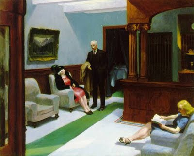
Such works can be compared with Edward Hopper paintings, and that is what I am attempting to achieve on my concept design. A 50's Beauty Salon with a rich pallete with pastel, vivid colours, bold, and almost making a flat look. A different attempt on concept art.
Edward Hopper
Also, I have been looking at concept from the Pixar film Monster's Inc. and I really like how uniform the environments look depict this strong colours.
The Art of Monsters Inc.
Alongside, I have been researching some adverts from that time, as they are really helpful, to understand was used to in terms of colours as well as cliches.
50's Adverts and Photos


To emphasize the overwhelming character of the beautician, I am attempting to add insult to injury, by creating a highly saturated, pastel coloured, clausthrophobic shop.


No comments:
Post a Comment